内容が古くなっている可能性がありますのでご注意下さい。
引き続きD3.jsを使用して横浜市の統計データをビジュアライズします。
今回は、表示するデータをユーザが選択できるようにします。
完成した画面は以下のようになります。
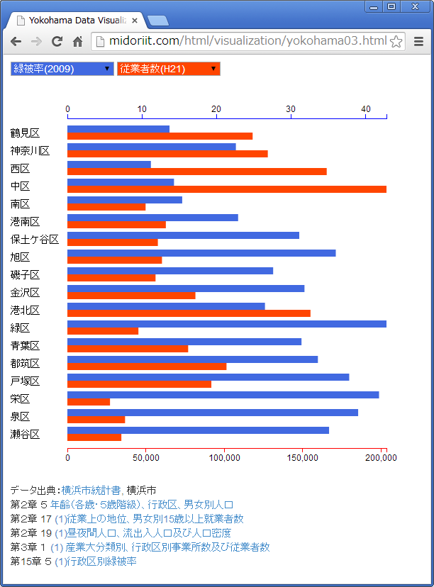
表示したいデータを青と赤のプルダウンリストで2つ選択することができます。この例では、緑被率と従業者数(その区で働く人の数)を表示しています。緑被率の高い区は従業者が少なく、従業者が多い区は緑被率が低いという大まかな傾向が見られます。
青と赤の棒グラフの目盛を、グラフの上下に表示しています。表示するデータの最大値に合わせて、スケールを自動的に変更するようにします。
こちらのHTMLファイルでは、実際にデータを選択して表示することができます。
まずはCSVのデータを用意します。
横浜市統計ポータルサイトからダウンロードしたExcelファイルから作成します。
ward,年少人口(H26),生産年齢人口(H26),老年人口(H26),夜間人口(H22),昼間人口(H22),就業者数(H22),従業者数(H21),緑被率(2009)
鶴見区,37070,186685,54335,272178,250323,132724,118174,13.7
神奈川区,26965,157892,47818,233429,233168,113520,127847,22.6
西区,10475,66760,18793,94867,170450,45980,165427,11.2
中区,15217,92544,31694,146033,243277,60977,203560,14.3
南区,20868,124191,47911,196153,154387,91476,49888,15.4
港南区,26837,135884,55027,221411,173691,101328,62810,22.9
保土ケ谷区,23711,129958,49513,206634,173514,94917,57714,31.1
旭区,30855,150559,66551,251086,197891,113501,60341,36
磯子区,19366,100645,41319,163237,136711,74474,56233,27.6
金沢区,25055,127348,50930,209274,195740,95645,81672,31.8
港北区,42268,233195,61276,329471,309610,160462,155079,26.5
緑区,25287,114337,38921,177631,146647,81590,45313,42.8
青葉区,44354,206375,56813,304297,234794,137185,77048,31.4
都筑区,36376,137709,31782,201271,193939,91660,101510,33.6
戸塚区,38325,172841,62205,274324,238630,127251,91840,37.8
栄区,16074,72895,33933,124866,97103,55035,27196,41.8
泉区,20515,94607,39143,155698,121197,69613,36794,39
瀬谷区,17266,76365,31710,126913,104258,56036,34436,35.1
1行目にはデータ系列名が入っています。
HTMLファイルのbody部のリストは以下のとおりです。
<body style="padding: 10px">
  <select id="select1" onChange="drawChart();"></select>
  <select id="select2" onChange="drawChart();"></select>
  <br/><br/>
  <svg width="550px" height="550px"></svg>
  <script type="text/javascript">

  var svg = d3.select("svg");
  d3.csv("yokohama03.csv", function(data) {

    var options = [];
    for(var option in data[0]) {
      if(option != "ward") {
          options.push(option);
      }
    }

    d3.selectAll("select")
      .selectAll("option")
        .data(options)
        .enter()
        .append("option")
        .attr("value", function(d) {
          return d;
        })
        .text(function(d) {
          return d;
        });
    select1.options[0].selected = true;
    select2.options[0].selected = true;

    svg.selectAll("text")
      .data(data)
      .enter()
      .append("text")
      .text(function(d) {
        return d.ward;
      })
      .attr("x", 0)
      .attr("y", function(d, i) {
        return (i * 25) + 66;
      })
      .attr("font-size", "14px");
    svg.append("g")
      .attr("class", "blue_axis");
    svg.append("g")
      .attr("class", "red_axis");
    svg.selectAll(".blue_rect")
      .data(data)
      .enter()
      .append("rect")
      .attr("class", "blue_rect");
    svg.selectAll(".red_rect")
      .data(data)
      .enter()
      .append("rect")
      .attr("class", "red_rect");
  });

  drawChart();

  function drawChart() {

    d3.csv("yokohama03.csv", function(data) {

      type1 = select1.options[select1.selectedIndex].value;
      type2 = select2.options[select2.selectedIndex].value;

      var scale1 = d3.scale.linear()
        .domain([0, d3.max(data, function(d) {
          return +d[type1];
          })])
        .range([0,450]);
      var scale2 = d3.scale.linear()
        .domain([0, d3.max(data, function(d) {
          return +d[type2];
          })])
        .range([0,450]);

      var axis1 = d3.svg.axis()
        .scale(scale1)
        .ticks(6)
        .orient("top");
      var axis2 = d3.svg.axis()
        .scale(scale2)
        .ticks(6)
        .orient("bottom");

      svg.select(".blue_axis")
        .attr("transform", "translate(80,40)")
        .call(axis1);
      svg.select(".red_axis")
        .attr("transform", "translate(80,505)")
        .call(axis2);

      svg.selectAll(".blue_rect")
        .data(data)
        .attr("x", 80)
        .attr("y", function(d, i) {
          return i * 25 + 50;
        })
        .attr("fill", "RoyalBlue")
        .attr("height", "10px")
        .attr("width", function(d) {
          return scale1(d[type1]) + "px";
        });
      svg.selectAll(".red_rect")
        .data(data)
        .attr("x", 80)
        .attr("y", function(d, i) {
          return i * 25 + 60;
        })
        .attr("fill", "OrangeRed")
        .attr("height", "10px")
        .attr("width", function(d) {
          return scale2(d[type2]) + "px";
        });
    });
  };
  </script>
</body>
プルダウンリストのためのselect要素とグラフ描画のためのsvg要素はあらかじめ用意してありますが、ほとんどの描画はスクリプトで行います。まず、
var svg = d3.select("svg");
d3.csv("yokohama03.csv", function(data) {
svg要素を取得し、CSVファイル読み込みのコールバック処理で、
  var options = [];
  for(var option in data[0]) {
    if(option != "ward") {
        options.push(option);
    }
  }
プルダウンリストに表示するデータ系列名の配列を作成します。さらに、
d3.selectAll("select")
  .selectAll("option")
    .data(options)
    .enter()
    .append("option")
    .attr("value", function(d) {
      return d;
    })
    .text(function(d) {
      return d;
    });
select1.options[0].selected = true;
select2.options[0].selected = true;
用意しておいた2つのselect要素をselectAll(“select”)で選択し、selectAll(“option”)でそれぞれのoption要素を選択します。option要素とデータ系列名の配列をバインドしますが、この時点ではoption要素はないのでenter()してからappend(“option”)でoption要素を追加し、value属性とテキストを設定します。
selectに対するループとoptionに対するループの、2重のループ処理を、D3独特の記法によって非常に簡潔に記述することができます。さらに、
svg.selectAll("text")
  .data(data)
  .enter()
  .append("text")
  .text(function(d) {
    return d.ward;
  })
  .attr("x", 0)
  .attr("y", function(d, i) {
    return (i * 25) + 66;
  })
  .attr("font-size", "14px");
行政区名のラベルと、
svg.append("g")
  .attr("class", "blue_axis");
svg.append("g")
  .attr("class", "red_axis");
目盛軸、
svg.selectAll(".blue_rect")
  .data(data)
  .enter()
  .append("rect")
  .attr("class", "blue_rect");
svg.selectAll(".red_rect")
  .data(data)
  .enter()
  .append("rect")
  .attr("class", "red_rect");
棒グラフのためのrect要素を作成します。
初期表示のために、
drawChart();
明示的にdrawChart()関数を呼び出します。drawChart()はselect要素のonChangeイベントでも呼ばれます。
drawChart()関数では、
d3.csv("yokohama03.csv", function(data) {

  type1 = select1.options[select1.selectedIndex].value;
  type2 = select2.options[select2.selectedIndex].value;
CSVファイルを読み込み、select要素で選択されているoptionの値を取得し、
var scale1 = d3.scale.linear()
  .domain([0, d3.max(data, function(d) {
    return +d[type1];
    })])
  .range([0,450]);
var scale2 = d3.scale.linear()
  .domain([0, d3.max(data, function(d) {
    return +d[type2];
    })])
  .range([0,450]);
2つのグラフで使用するスケールを作成し、
var axis1 = d3.svg.axis()
  .scale(scale1)
  .ticks(6)
  .orient("top");
var axis2 = d3.svg.axis()
  .scale(scale2)
  .ticks(6)
  .orient("bottom");

svg.select(".blue_axis")
  .attr("transform", "translate(80,40)")
  .call(axis1);
svg.select(".red_axis")
  .attr("transform", "translate(80,505)")
  .call(axis2);
目盛軸を描画します。ここでは、select(“.blue_axis”)のように、クラス名を指定して要素を選択しています。
最後に、
    svg.selectAll(".blue_rect")
      .data(data)
      .attr("x", 80)
      .attr("y", function(d, i) {
        return i * 25 + 50;
      })
      .attr("fill", "RoyalBlue")
      .attr("height", "10px")
      .attr("width", function(d) {
        return scale1(d[type1]) + "px";
      });
    svg.selectAll(".red_rect")
      .data(data)
      .attr("x", 80)
      .attr("y", function(d, i) {
        return i * 25 + 60;
      })
      .attr("fill", "OrangeRed")
      .attr("height", "10px")
      .attr("width", function(d) {
        return scale2(d[type2]) + "px";
      });
  });
};
rect要素にサイズを設定して棒グラフを描画します。